


Brand Elements in Use

The Framingham State University design system should be reflected in all public facing collateral. Here are a few things to keep in mind when applying these elements to various materials:

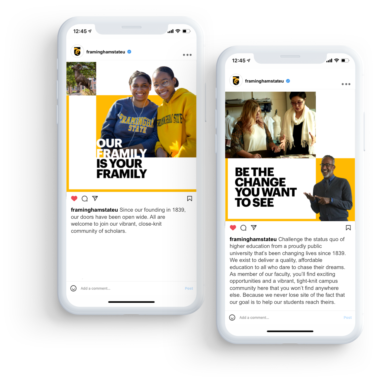
  • The yellow border is intended to highlight areas on the page that you’d like the viewer to pay attention to (In most cases, it should be used on the left hand side of the page where our left aligned copy is, and/or along the bottom to direct you towards the logo)
  • The yellow border should never act as a frame around an entire ad. There should at least be an image breaking the lines or and edge left white to avoid closing all of the elements in.
  • In print and social, the border should go behind (or stop at) the photography. The border should not run over it.
Print Ad Examples
Print ad example 1
Woman looking at beaker
Social Post Examples
Marketing example on cell phones
Email Example
Email example
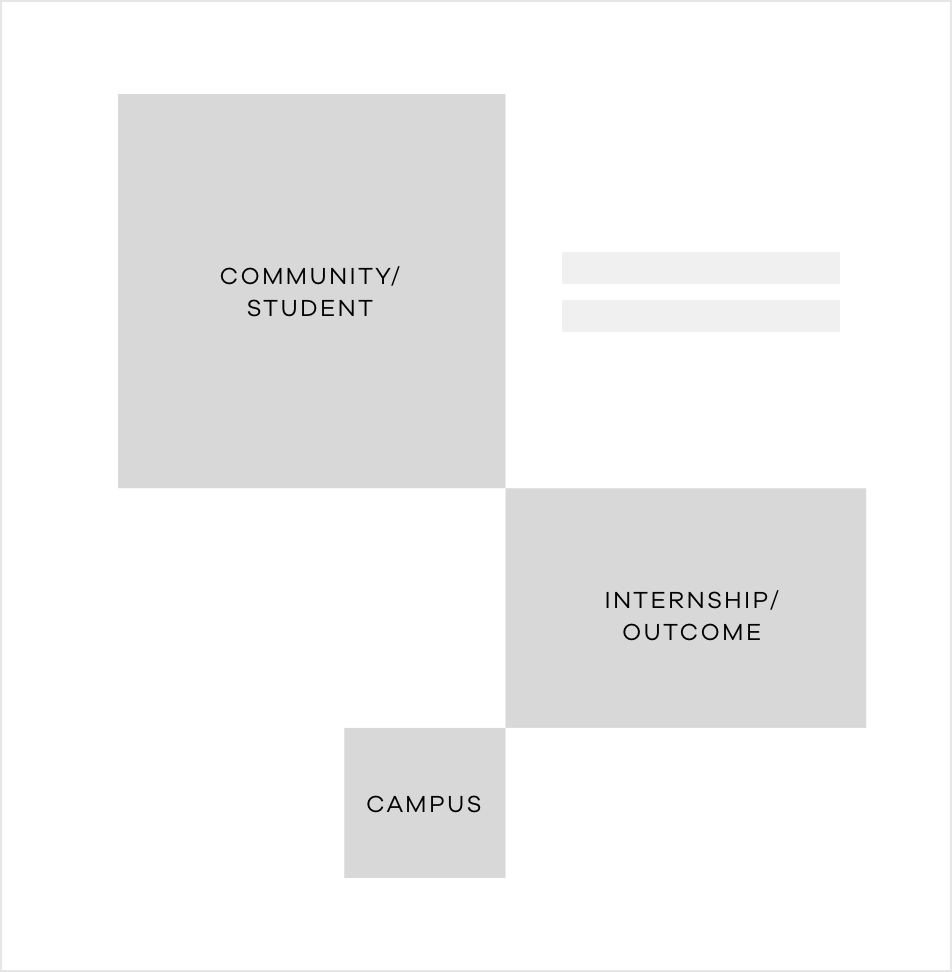
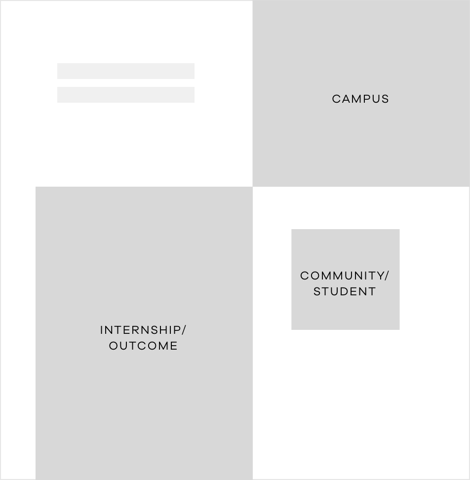
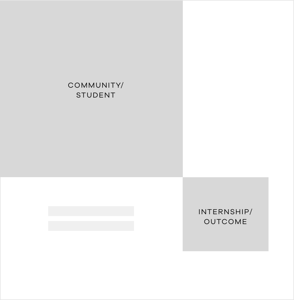
Sample Layouts
Sample layout 1
Sample layout 2
Sample layout 3
Sample layout 4