

Fonts

Headline Font

Graphik

Graphik-Bold

Aa Bb Cc Dd Ee Ff Gg Hh Ii Jj Kk Ll Mm Nn Oo Pp Qq Rr Ss Tt Uu Vv Ww Xx Yy Zz
0 1 2 3 4 5 6 7 8 9

  • Graphik is our primary font and should be used for titles, subheads, button and text links, eyebrow text (like dates and form field descriptions) and in the navigation.
  • When used as a title font, Graphik should be primarily used in its heaviest weight (black) and in all caps.
  • The line height should be the same as the point size.
  • Due to licensing, the Graphik font is not available to download.
  • For consistency and to maintain our brand identity, always use the Graphik font as the primary typeface. If Graphik is unavailable, Elza may be used as an approved alternative.
Body Copy Font

DM Sans

DMSans-Regular

Aa Bb Cc Dd Ee Ff Gg Hh Ii Jj Kk Ll Mm Nn Oo Pp Qq Rr Ss Tt Uu Vv Ww Xx Yy Zz
0 1 2 3 4 5 6 7 8 9

  • DM Sans should be used for all body copy, buttons and subhead copy.
  • In print, body copy point sizes should be anywhere from 10-12pt, and on the web 16-18px.
  • DM Sans is available to use in multiple weights. 
Headline Font

Lora

Lora-Regular

Aa Bb Cc Dd Ee Ff Gg Hh Ii Jj Kk Ll Mm Nn Oo Pp Qq Rr Ss Tt Uu Vv Ww Xx Yy Zz
0 1 2 3 4 5 6 7 8 9

  • Lora should be used for titles, subheads, and quotations. 
  • When applied as a title font, use Lora Bold in Title Case. The line height should match the point size. 
  • Lora is available in multiple weights for flexible typographic use.

Typography Do's and Don'ts

Some examples of how to successfully use Graphik as a title font.  

Do

Be bold with Graphik by overlapping images.

One of a Kind Program

Don't

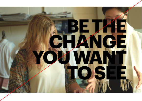
Overlay headlines over images with difficult contrast or block faces with type.
Don't image 1

Do

Frame headlines between images and other graphic elements to draw attention to them.

Overlapping images using Graphik

Don't

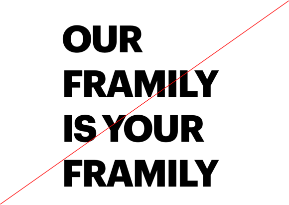
Use too much leading. The line height should be 15% less than the point size.
Don't image 2