The Framingham State University design system is a foundational element for all public-facing materials. To ensure consistency and professionalism, adhere to the following guidelines when applying design elements:
Gold Bar
The yellow border is designed to draw attention to specific areas of the page, typically on the left-hand side where left-aligned copy resides or along the bottom near the FSU logo.
It should not frame an entire publication; leave white edges or break the lines with imagery to avoid enclosing all elements.
In print and social media, the border should appear behind or stop at photography, avoiding overlap on images.
For smaller publications, use a border thickness of 0.125 inches.
For all larger publications (over 16”x24”), increase the thickness to 0.5 inches.
Line Arrow
The gold line arrow is intended to guide users toward QR codes or other actionable elements.
Pair it with a call-to-action phrase such as "Learn More" or "Visit Us" to direct user engagement effectively.
Bullet Points
Begin bullet points with a lead-in line for context and clarity.
The hierarchical structure of the bullet points is organized as follows:
Primary level: Use "•" as the symbol.
Secondary level: Use "▪".
Tertiary level: Use "○".
Each bullet point should consist of one concise sentence for clarity and focus.
Subheading Frame
The rectangular frame with rounded corners is ideal for categorizing information or directing readers to the University’s website.
Align with Framingham State University's official colors, incorporating accent colors when necessary.
Telephone Numbers
Use dots to separate codes for consistency and readability (e.g., 508.626.4500).
Photography Pairing and Layout
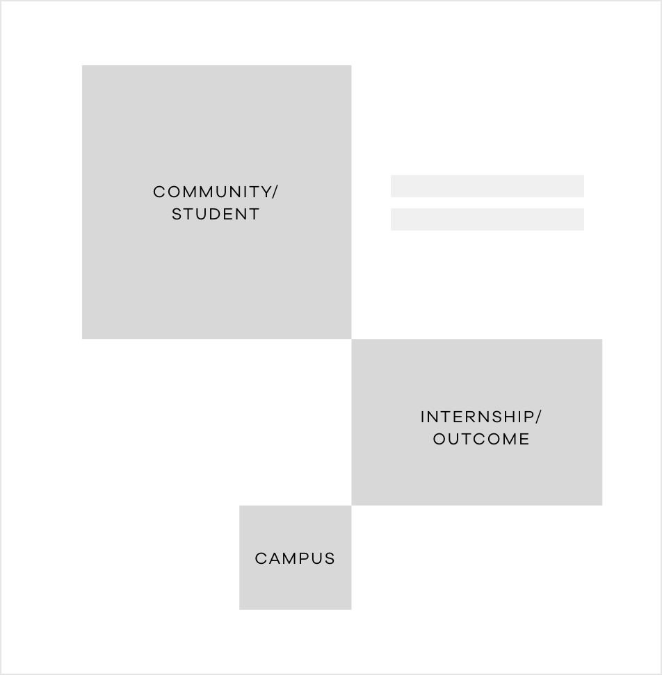
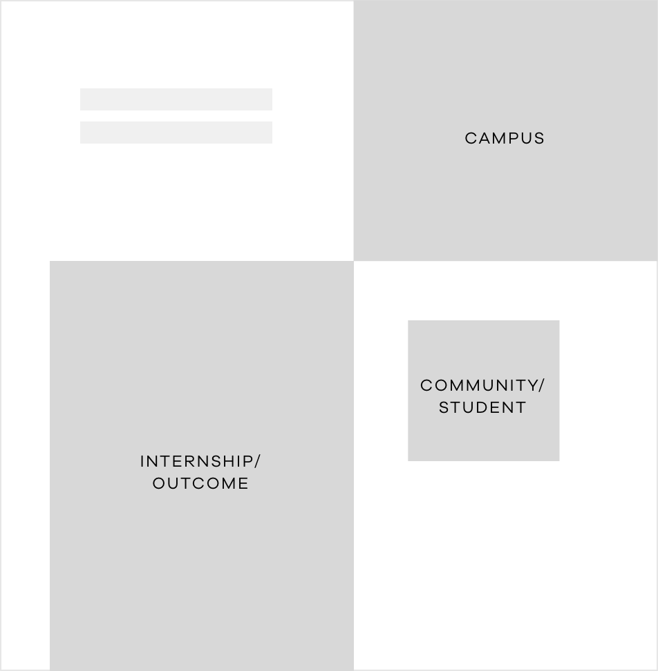
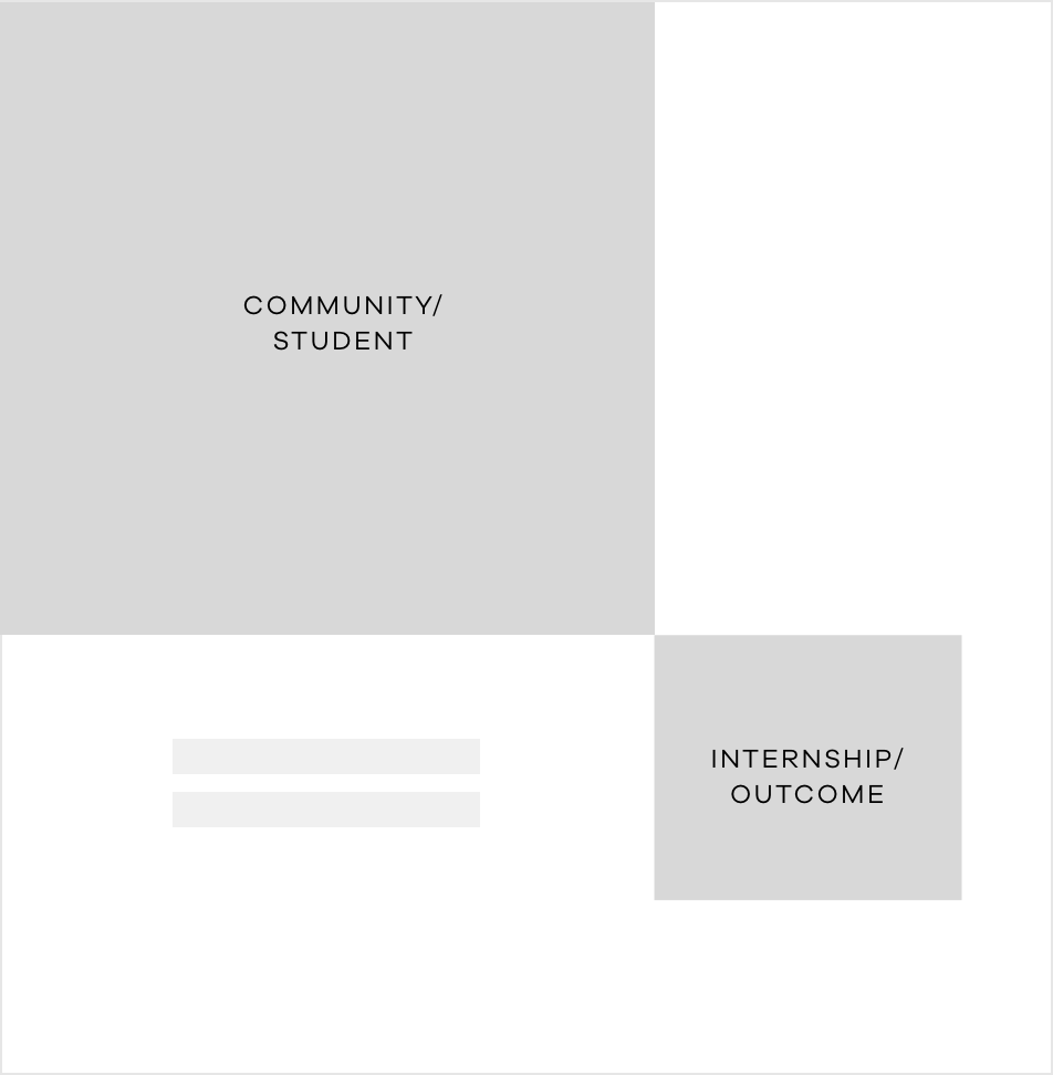
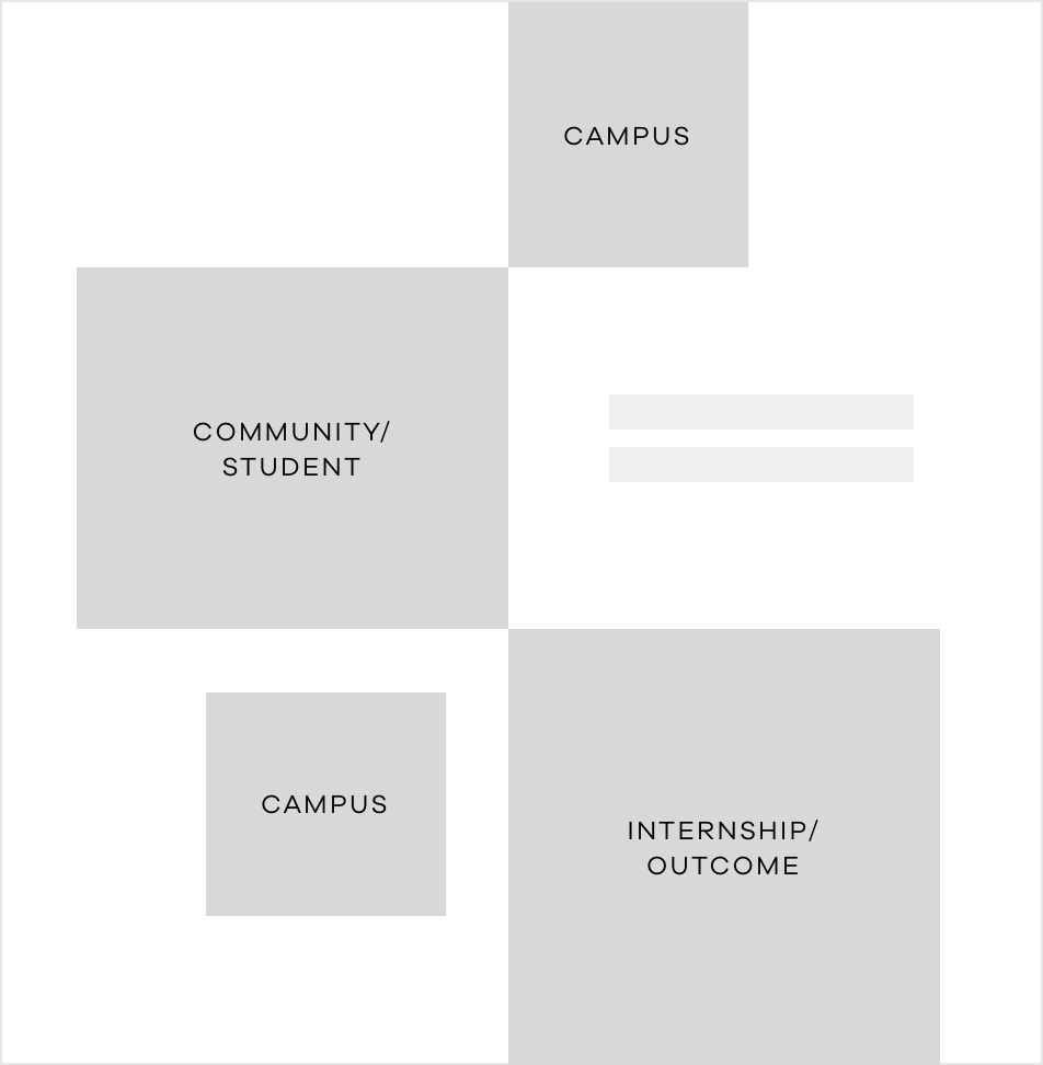
Our gridded brand look allows us to use multiple images to tell a more complete or layered story. Careful consideration should be given to each photo included in each communication to be sure a cohesive story is being presented. When selecting and pairing photography, here are some helpful guidelines to follow:
Multiple photos should be used to best paint a picture of the Framingham State University experience.
Photos should be representative of the community, campus, surrounding area and student outcomes.
Photos are placed within a connected grid to create structure. Different image sizes are encouraged to add depth.
For smaller image spaces, be careful to select photos with a singular subject so that people and places are distinguishable. Avoid busy photos and large group shots.